Monday, 12 December 2011

Finished Film Poster


Evaluation
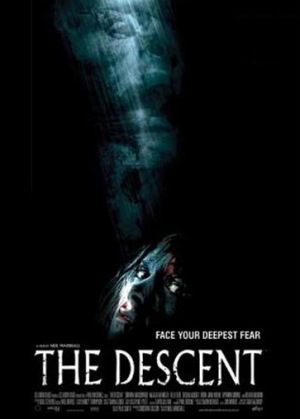
This is my finished film poster. I have followed several film poster conventions such as structure and text. I have used a little review "the deeper they go the harder they fall!" from a made up company 'RESPONSE'. The reason I have chosen to put this on the top left is that it is in a visible place to see but doesn't interfere with the effect of the two images. The way I have placed the two image is highly influenced from the poster of The Descent. This poster was my main inspiration from a psychological drama poster as it is appealing to the audience and has relevance to the story line. I had to thoroughly edit the two pictures to get the effect I was looking for. The bottom picture, to give it a night vision effect, I had to put a green layer over the top and edit the contrast and saturation to make it look as realistic as possible. I used the magic eraser tool to get rid of some of the brickwork around the edges to make it look kind of 'ripped' and 'torn'. I then changed the opacity of the image to fade it out a bit so that its not as bright and blends in with the background and the second image. All of these little changes I have made have been influence by a variety of different posters mainly The Descent. With the second image I also used the magic eraser tool to eliminate the cracks in-between the brick work so that when I moved it onto the black background the black would be in between the bricks. I then had to put a grey scale layer over this image to get rid of the green tint of moss from inside the mine. I did this because the two green colours from each image wasn't the same and so it didn't look quite right. The grey scale completely blacks out the figure and makes it look more mysterious. All of the editing for this poster I did on Photoshop CS5.I kept the colours to a minimum as I really want the green from the main image to stand out. I put colour on the the little review section on the top left as reviews are what people look for to 'persuade' them to watch the film.
To make my title I made a new layer and entered my text. I chose between several fonts and colours and asked a few people which looked better, this font and colour had the most amount of likes and so I used this. Once I had found my text I used the 'wind' effect to scatter the edges of the letters to give it an old worn effect. I then used the 'Liquify' tool to distort the letters. The institutional information at the bottom below the image is another media convention which i have followed. I squished up the text at the bottom to mimic how other posters have displayed this information. I wasn't to sure what to write here so I wrote the release date, the production company and a list of people involved. I don't think there is much more I could have done to follow media conventions or to make my poster look more professional.

Sunday, 11 December 2011

Narrative Theory

We have use verisimilitude to create a real world for the story in our trailer. The use of naturalistic props and clothing in a location which you are expected to see all of these things is how we created a naturalistic storyline for the audience to follow. Because the audience  don’t know how the story ends from watching the trailer it has not got a closed narrative structure. Our trailer does not show any evidence of a multi stran structure.  Roland barthes has 5 narrative codes, from these our trailer includes Enigma, the audience has to figure out what is going on inside the mine. Action, you see action shots of the actors on bikes performing tricks and entering the cage. Those are the only codes that we really use. From Todorov’s theorythe audience doesn’t see much of his structural idea from the trailer but the film itself would go on to meet this structure of equilibrium and disequilibrium.

Friday, 9 December 2011

Trailer Analysis: The Descent 2


Once we had got all of our footage and nearly finished editing we decided to look at more film trailers which the story lines have influenced us. We only saw this trailer after and realised how similar the techniques we have used are. Both the trailers have a short clip of an image being turned into a photograph, the only difference is that on the Descent 2 trailer the image is in black and white and ours is covered with sepia tone.
The storyline for the Descent 2 is similar to ours and is shown through a variety of camera shots and angles. At the beginning there are a few close ups of the friends faces concentrating on the sporting activity and enjoying themselves. As the trailer progresses the atmosphere changes and so do the feelings of the characters. The facial expressions change to portray fear from being inside the mine. This is a similar sequence in both trailers.
The music in this trailer progresses with more bass and louder sounds. The same things happens in our trailer. this is a media convention for thriller, horror and drama trailers. The editing and music paces speeds up towards the end of the trailer creating suspense. the reason for this is that the trailer finishes on a 'cliff hanger' to draw you in to want to watch the full film.
Overall I think that this trailer succeeds to capture attention as a psychological drama. The variety of editing techniques are definitely inspiring to our trailer and we will be trying to use some similar techniques. I think that our group will have to look into adding text into our trailer to cut in between different establishing shots at the beginning. The fades between these are really effective when the daunting music is playing and when they are in time. After realising how similar this trailer and ours i will definitely be encouraged to use some techniques from this trailer.

Tuesday, 6 December 2011

Editing our trailer


The first thing we had to do was to transfer our footage from the cameras onto the computer. There was a few complications with this as at first we were going edit the footage on the Macs in college. this proved a problem for other groups wanting to do this as only the images were transferring and none of the sound. We didn't want to risk this happening with ours because we have a small amount of dialogue in ours. We uploaded all the footage straight onto Isaacs apple laptop and started to put it into final cut pro.
The next step was to look back at our storyboard and put our film footage into order. We chopped and changed some of this to suit the images we had taken. Not all of the shots we planned to do were captured as they proved more difficult then we thought. We overcame this situation by taking different shots from different angles but of the same image to fill the space.
Once all the footage was in order we cut of the extra parts and then started to structure our film trailer. We wrote down where we wanted certain cuts to go at the times. Once all of the cutting had been done we just had to put in the special effects and fades. By using Final Cut Pro we were able to add in different effects like 'sepia tone' and dark/light fades between shot changes. All of the different camera angles look good especially when the actors are on the bikes. We used fast paced editing to put these different shots together as this is more of an action scene.
After the bike scene there is a short documentary moment when two of the friends pick up the camera and film themselves running away from the third friend into the mine. for this shot we edited on a frame around the camera screen and the word 'recording' with a red circle next to it just inside the lines. This shows that it is being recorded by them. The most challenging part of editing was cutting in the image of a black figure stood just inside the mine entrance with the light coming from behind. We then mixed this image with one of a 'fuzzy' TV screen. (At the end of our image editing we added the sound of the TV screen over the top of the music)
The music track over the top of the trailer is one that we found is from a royalty free music website which is copyright free and free of charge. The music track is quiet and eerie which goes perfectly well with our trailer. We would have liked to use an actual artists music track but we couldn’t because of copyright legislation.
With all of our editing almost done we have realised that we need a stronger ending to our trailer like most pyschological trailers we have researched have. We have scheduled to go back to where we filmed previously and take a last shot. We can then finish our editing and then complete our blogs and other parts of the promotional package.

Friday, 2 December 2011

Photoshop knowledge expanded


To prepare myself for editng my posters and magazine front cover I am practising using photoshop by editing different photos and using a range of tutorials from YouTube which I have found help me.
(Left) Is an image I found on google (Right) is the image I edited using Photoshop CS5.
The video below is the one I used to help me.

Below (Left) is another image I found on the internet of a model. I have changed the colour of her and and eyes, i have also enhanced her lips and put a light pink colour over the top. I have given her more of a tan. I picked green eyes as i think it looks completely different from the original image I used.


Friday, 18 November 2011

Making my poster

Making a poster for our film 'Spence Level' is complicated as we have hundreds of photos of the scenery and actors but its hard to find one that is suitable for a poster. from our shooting day we have various photos of the landscape, evidence of our shooting and also some action shots of the actors.
By using The Descent's film poster as my main influence I have chosen a few images which I think will work particularly well. These two pictures are rough ideas of the layout and images I want to use in my poster. These posters are not finished. I showed the rest of the media group, which is roughly the age of our target audience, and asked them to vote on which images work better on the poster.

The one with the green image at the bottom was the most popular in the voting as people said it had more relevance to the film trailer. Throughout the process of making my poster I continually looked back to the Descent's poster and some of the media conventions followed within. for example, the rule of thirds is used and the images are either on one side of the poster or on either side. There are a variety of posters for each different film. To really create the psychological effect I wanted I knew that I would have to have a picture of someone’s face quite close up. There is more fear in someone’s eyes then in an inanimate object. I have used the same style as the poster for The Descent by using two images. The text I have used is distorted for an eerie effect.

Monday, 14 November 2011

The Descent


This is the main film poster which I drew my inspiration from.there are various different postersfor The Descent but this is the one I mainly wanted to use similar conventions of. The main attraction to this poster is the image at the bottom of the females face. This draws you in in a psychological way as eye to eye contact is established. The image above this is of antagonist in the film. This gives the thought of the creature having poser over the females in the cave. I want want to create a similar image on my film poster. I like the placing of the text at the bottom of the screen as you focus more on the image in the middle.
I would want to try and create a similar style of text and layout as this poster.

Friday, 11 November 2011

Storyboard

These are the notes we took with us when we were shooting our trailer. They are a rough idea of all the sort of shots we needed and a variety of angles.

Filming Day

Saturday 5th November - SUCCESS!!!

First half of filming
Up at 7:00am and already on our way to Arron’s house (cast member) to pick him up and one of the bikes we are going to use in our film trailer. The first problem we had was trying to fit the mountain into Tom's boot. We had no roof rack or trailer for the back of the car. After pulling two seats down and taking the front wheel off the bike we managed to fit the bike in the car.
On arrival Isaac and his brother Arty (also a cast member) had started to set up the equipment. We had a short briefing with the cast so they knew exactly what we wanted and how. With all three of the cast members (Arron, Arty and Adam) and filming crew (Me, Tom and Isaac) we were able to start filming straight away. I was in-charge of taking pictures of us filming and also to help direct.
We all had a go at filming on the cameras, taking pictures holding the boom pole and directing the actors. We soon realised that filming all of our shots was going to take much longer then we expected. Our first shot which was simply the three of them getting out of the car in their bike clothing and putting on their helmets. This proved trickier then we thought it would. We didn’t notice the boom pole or cameras reflection on the car door or the fact that they were getting out of the car at the same time and then all putting their helmets on in sync. We were trying to get the timing right without it looking staged.

The next shot was mainly done by one of the actors who had to place the camera on top of the car and then return to the group and pose huddle together as if they were waiting for a picture.
We are going to edit the end of this shot with a white fade out as if the flash of the camera went off and took a picture of them. This is then going to quickly edited together with the action shots of the three on their mountain bikes. Some of these shots were harder to get than others. It took two hours to get the first half of the footage we needed. Some of the best bike shots we captured were when they were riding down hill as they picked up some speed and flew past the camera.
We caught this from different angles, mainly low down on the ground, one facing towards them when they’re coming downhill and then one in the middle where there was a little bump in the road which allowed them to come of the road and do a little ‘jump’. The last shot for this section was one camera low down on the gravel facing away from them looking downhill just before the bump which caught them landing and then carrying on. All the shot from this section are going to be edited together quite fast to with some fast music to give it that really sporty/ action feel.
The last kind of action bike shot we did before our lunch break was the panorama shot of the cyclists down low. This is where our second hurdle happened. Isaac and Tom were taking one of the camera’s too the top of a hill across a small river so that they could film, Isaac and myself both had walky-talky’s so that we could communicate from far away so that I could signal the riders when they had set up the camera ready. The walky-talky’s were working at first but when we got to our locations the battery died on them so we had to result on waving and using big arm signals to communicate. The shot went well and they captured everything that we needed too. We decided to take a half hour lunch break and then carry on filming.
After Lunch
Isaac’s dad arrived for supervision on the mine filming. We took a few more shots of the riders on the bike. The next few shots were of them entering the mine without one of their friends to go and hide from him. He then returns from what we made look like ‘going for a wee’ to find their bike helmets and bags laying outside the mine. He then starts to enter in their calling their names and entering cautiously. These shots were quite easy to take as he was quite nervous walking into the front of the mine anyway because there was freezing cold water on the floor and dripping through the stones inside.
We won’t need to really edit any off these shots to make it ‘eerie’ apart from a soundtrack which will be only music notes. Inside the mine we used the Go-Cam strapped to one of the actors chests at a time. We are hopefully going to put a green layer over these clips to make it appear as though it is in night vision. We had to use on of Tom’s lamping lights to light up the actors faces when they are walking in as it was far to dark to see anything in the first couple of meters inside. We didn't have to go any further than this as the mine blacks the light out completely.

Filming Day photoshoot and Evidence


Monday, 31 October 2011

Shooting

We have decided that we are filming this weekend. It is the only chance we have to use both of the big cameras and the boom pole.
The outlook for the weather on Saturday the 5th is sunny with cloud and showers which is good for our filming conditions. As long as it doesn't rain too much then we will still be able to film the mountain bikers outside of the mine and then just entering the mine. If it does rain a lot we will have to make sure that the water level in the the beginning of the mine has not risen.
The things that we will be taking with us are:
  • 2 Big Cameras, for filming both the actual trailer, and the actual production and behind the scenes of the trailer filming. 
  • Handheld Camera for shots inside the mine if its not possible for the bigger cameras to do so.
  • Still Camera of pictures of the filming.
  •  Go Cam
  • Boom pole or whatever its called?
  • 2 tripods for the big cameras
  • Handheld Torches/ Spotlights
  • Head torches
  • Technical Equipment: Laptop to edit and analyze footage. Also to upload images taken.
  • Helmets for mine.
  • My car in order to carry equipment.
Clothing: 
  • Waterproof jacket
  • Leggings
  • Fleece
  • Wellies
  • Rucksack for technical equipment
  • Spare clothes.
Cast Equipment/ Clothing:
  • 3x Bikes
  • Cycling Equipment
  • Zippo Lighter 
  • Cycling Clothing - Helmets, gloves, body suit, shoes etc.

Tuesday, 18 October 2011

film magazine analysis


Empire
Again this magazine cover follows all the main media conventions for a magazine. For example, the title is the biesst and boldest text on the page to make it it obvious and easy to identify. There is one main image on the page to represent the main article freature within.The font and colour used on this cover represents the different stories and to show the most important and least important stories. For example, 'EMPIRE' has a mocuh constructed font to portrat a building, if you look at the 'M' it could represent two building corners to imply the 'Empire' of the film magazine industry. This makes you think that it is the best magazine to find out about past, present and future films. the quotation 'BLOODY HELL! Harry comes out fighting' is placed right next to Harry Potters face which is indeed all bloody. This ties in with the main article of the magazine which gives you an insight as to what is going to be discussed. There are also features of other things such as other films being discuessed which are of less importance so are displayed at the bottom of the page in smaller writing. There is a '45 new movies you need to know about right know!' block on the top left which is going to take up quite a lot of the magazine so it is quite important to have the visibly on show.

Friday, 14 October 2011

Film Poster Analysis


SAW
Genre-
Horror/ Thriller/ Torture

The first thing that you see when you look at the poster is the image. Normally you will see the victim or the villain as the main image or you could see the two too show binary opposites of good and bad. Usually a severed hand would be shown quite bloody with bright blood. This isn't, it is quite dark with hardly any blood showing, it makes it look quite old and dirty but contrasting it is laid on a tiled floor which is quite clinical. The title is underneath the image which looks more gory then the actual image itself. The poster doesn't really follow the main conventions of a film poster as horror posters are usually dark and the blood that is shown (if any) is usually brighter and there is more of it. The colour of the title is the same dark colour as the blood from the hand and therefore ties in with a 'saw'. The institutional information follows the convention of being the smallest text on the page and being at the bottom out of the way from the main image and title.

Thursday, 13 October 2011

Location Photoshoot

On the 3/10/1 our location photoshoot took place in Reeth Moor Estate at Spence Level. We have permission from the head keeper Paul Simpson to film in Spence Level, Old Gang and Hard Level. The outcome of the photoshoot was over 60 photos of various parts of the landscape which would be appropriate to film on. We also had a few videos and from these we figured that we would most deffinately need a boom pole to remover the wind from our sound videos as it is extremely open and windy. The Tom and Isaac prepared themselves to go into the opening of the mine with such epuipment as:

Epuipment-
*Lighting: Handheld torghes, head torches
*Video: Handheld Camera, 'Go Cam'
*Photo shoot: Still Camera
*Clothing: Waterproof jacket and leggings, fleece, wellies, rucksack for technical equipment, spare clothes. *Technical Equipment: Laptop to edit and analse footage. Also to upload the images taken.

The first lot of images that you will see below is where we are thinking of filming the cyclists riding around. We have chosen these places because surrounding them are good places for us to get some interesting camera angles and shots.


These shots are the main ones we want to use to before they enter the cage. The idea of this has come from the film 127 Hours when he is riding through the desert and there are a mixture of shots and angles throughout. All of these shot are from outside the mine. It is too dark to use a normal DSLR Canon camera but with the bigger technical video camera we can take more clearer shots whilst using a portable Arc Light. Also we will nheed to use a Boom Pole to prevent the wirey noise of the wind interferring with our sound.


All of the shots from the section above are where we are going to film some of the more interesting angles with some establishing shots to show the landscape and how deserted the mine is. The two larger images in this section are ones that are going to appear in the trailer which might flash on and off but as a combined cut. We have a chance to get some really amazing, effective shots as there are lots of smaller focus points to add depth to what we are shooting.

Wednesday, 5 October 2011

Developing stages for Trailer

Whilst analysing film trailers I found that they have lots of institutional information at the beginning. Most trailers have the gtreen screen with the film ratings information on it. I have recreated one with the typically information on it. I tried to find an original one that contained the relevent information as our trailer but
I couldnt so i made our own.

This will be shown at the begginning of our trailer along with some more information such as the name of our company etc.

Thursday, 29 September 2011

Company Logo

After thinking about all sorts of logos we see everyday we thought long and hard about what would make ours original but stand out. We looked at these few logos from some of the bigger film companies and decided on something more simple and easier to recognise as a movie company logo.
On the image left logos 7,8,10,11,12 and 13 all have a circular look about whether is is a building in the image or a land mark. These represent big things in life and make you think that the companies are going to be big.
Logos 1,4,5 and 6 are mainly focused on the text (namje of the company) and so are much easier to recognise.

Below is the logo our group came up with. We decided to to use an image and text as the name of your company is important and we wanted to show that, but also we wanted an image that people can relate films too.
These are some rough sketches of the logo, all of them are quite similar and all include a kind link to filming such as there is a popcorn bucket or a camera.

We may end up changing the logo if we suddenly come up with a better idea.